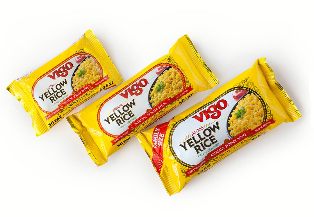
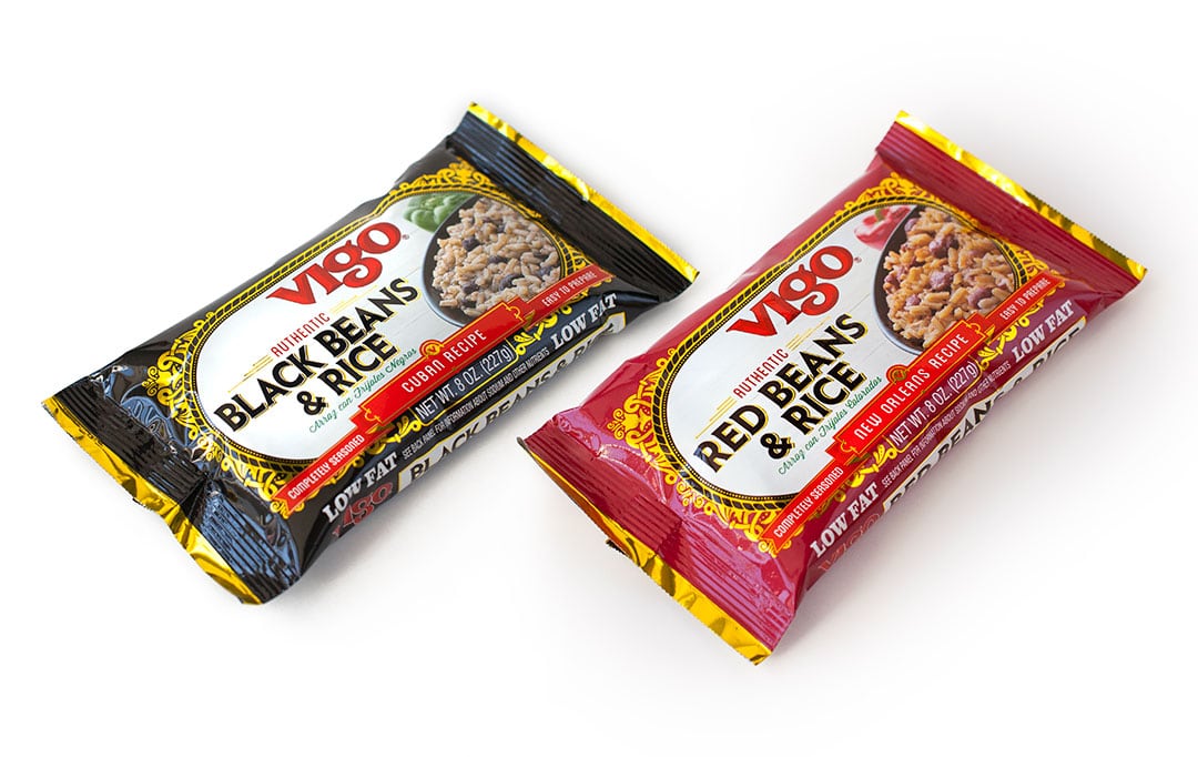
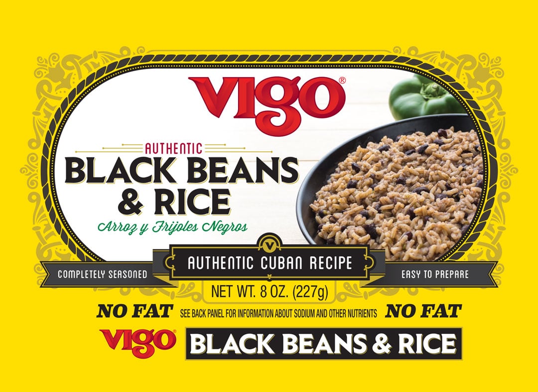
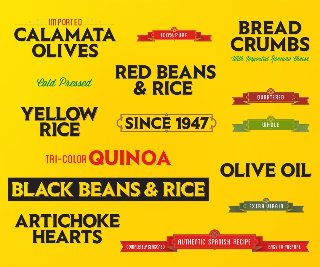
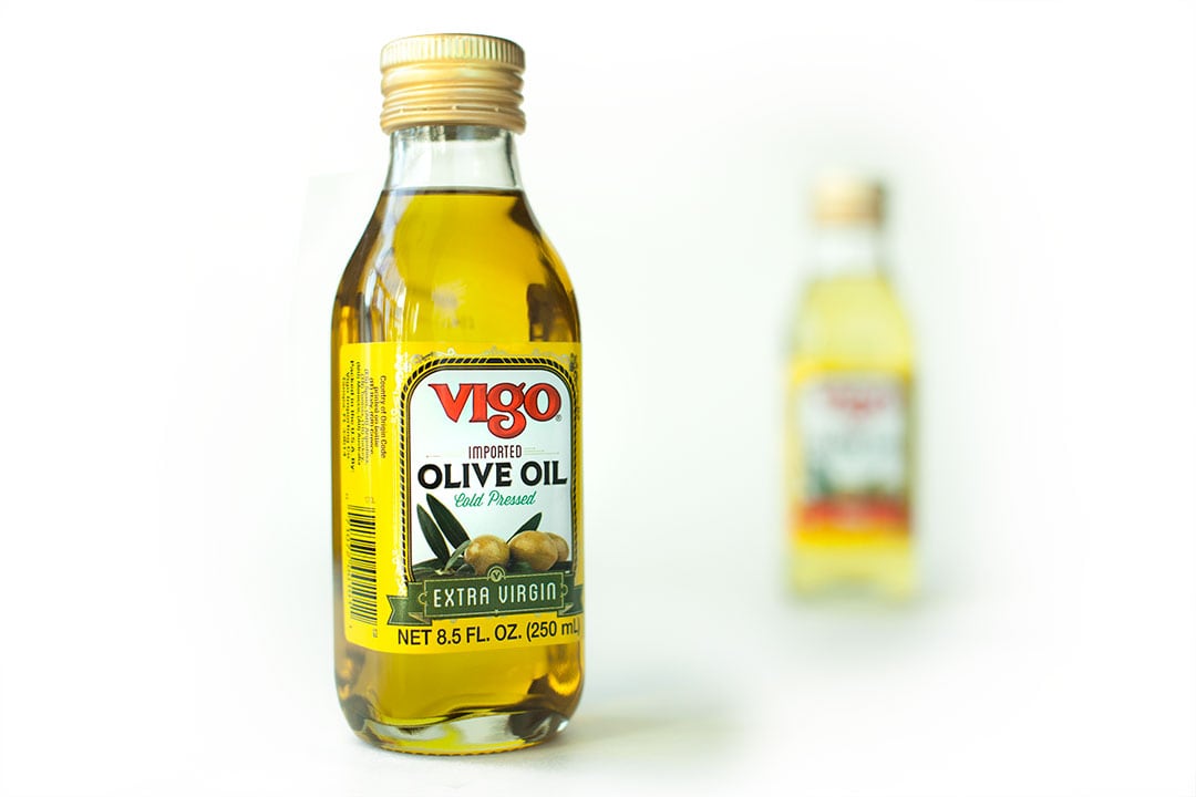
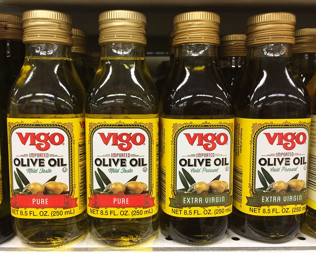
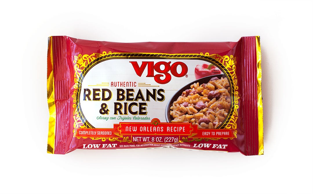
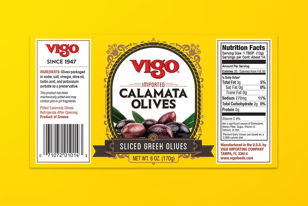
When I got the opportunity to re-design the packaging for the most famous Yellow Rice in the country, the brand I bought on a weekly basis, I was excited. I knew that Vigo was an estabished brand with a lot of equity, even at a glance with it's bright yellow glow. The problem that needed to be solved was how to unifying 100s of products, classing it up with smart design, and not illiminating the equity built by decades of quality. Another hurdle to pass was getting the product on the label. On every label, and shot in a way that would be unique to the brand and work across the product line. Even the main font was created custom for the brand. This was a huge endevor for me that will hopefully last another 50 years for Vigo.